Introduction
Reading time: 20 mins.Introduction
However simple in appearance and quite common, the notion of color is in reality a complex issue. It is not only something that can be described scientifically in which case we could only have an objective and rational view on the matter. Colors is also the result of a process that involves vision, one of sensory systems through which we perceive and interact with the world around us. As such, it is also a very subjective matter with a psychological (the meaning of colors) and physiological (how does our brain process colors) component (have you ever experienced an argument with another person about the color of an object?). You have also probably been all fooled by some well known optical illusions which is another example of the influence of the mind on the way we perceive shapes and colors. We won't go into that much details, and we will stick to how we can represent, store and display colors in the world of computers however, this is just to say that the topic is much more complex than it looks at first glance. The study of color is usually referred to as color science which includes all the elements we have mentioned above: how does the brain process visual stimuli into what we perceive as colors, the use of colors from an artist point of view, and the study of electromagnetic waves which is responsible for light as it exists in the physical world. Dealing with colors within the realm of digital displays which is also a science on its own (which is sometimes refer as color management).
Light
It all start with light. Before we can look into colors we first need to understand light and how light interacts with matter. Light travels through space as electromagnetic waves but can also be described as a stream of particles which Einstein called photons (which is the reason we say that light has a dual wave-particle nature). In this lesson though, we will only consider light in its wave form. A periodic wave as we know, is defined by its frequency (the number of times a cycle is repeated per unit time) or its wavelength (which is the reciprocal of the frequency) which is the distance over which the wave's shape repeats. The color of light can be seen as the equivalent of the concept of pitch for sound. Both are based on the wavelength or frequency of the signal traveling through space (check the lesson on light-matter interaction to learn more about light's wavelength and frequency).
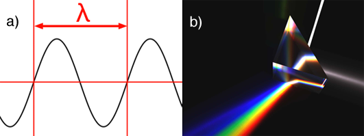
A wavelength is denoted with the greek letter λ (lambda). Visible light is made of waves which frequency varies from 380 to about 740 nanometres (a nanometre is


Most people are also familiar with the Newton experiment which consists of using a prism to decompose white light into a rainbow of colors (figure 1b). This experiment shows that white light is made of all the visible colors from the visible light spectrum, mixed in some proportions. The prism experiment can also be carried out the other way around. If we take all the light colors from the visible light spectrum and add them up in the same proportions, then we can recreate white light (figure 2). White light as such doesn't exist. White light is the result of a light source, the sun or the screen of your computer, producing a mixture of light colors from the visible spectrum. If you examine your computer screen or television with a magnifying glass, you will see tiny dots, probably red, green and blue and by mixing these colors in different amounts, a large range of colors can be produced.

Pointillism is a painting technique by which sensations of colors can be obtained by putting small dots of pure colors side by side in organised patterns rather than using the more traditional way of mixing colors on the palette. From the distance, the colored dots blend into one single color. Screens work in very similar fashion. Each pixel from the scene is actually made of three small components which emit red, green and blue light. By changing the amount of red, green and blue light emitted, we can create all the colors we need. From the distance these three separable elements are indistinguishable and the contribution of each light blend within each other to form one single light color. The next chapter will provide more information on the way screens actually work.
The Human Eye

Before we look a bit more into what colors are and especially better understand what we call white, it is useful to understand how the human vision system works and responds to light stimuli. The back of the eye (the retina) is covered with light sensitive receptors which we call cells. Eyes are equipped with two types of photoreceptors: the cone cells and the rod cells. Cone cells are responsible for our color vision (or trichromatic vision) and are mainly concentrated towards the centre of the retina. Rod cells which are located towards the outer-edge of the retina, are more sensitive to smaller amount of light than are cone cells. We need very little light to start discerning shapes but in low light conditions, you may have noticed that we do not perceive colors well. In such low light conditions, cell rods are still sensitive to light but can't reproduce colors whereas cone cells which are responsible for color vision do not have enough light to actually be stimulated. Cone cells come in three types and each type is sensitive to a particular range of the visible spectrum. And not surprisingly, each type is sensitive to approximately red, green and blue light which are the three colors used in computer displays to recreate all the colors from the spectrum (and white when these three colors are mixed together in equal amounts). For this reason, we say that the cone cells are responsible for our color vision or trichromatic color vision (because our system uses three primary colors to distinguish intermediate colors.
Primary Colors: Additive vs Subtractive Colors
There is actually two possible answers to the definition or primary colors depending on whether you come from the computer world or from an art school. In the world of computers and set lighting technicians, the primary colors are red green and blue. In the world of artists, the correct answer is yellow, magenta and cyan. The two answers are correct but depends on whether you consider colors as being additive or subtractive. Lets explain. Earlier in this chapter we mentioned that white light could be produced from adding up the contribution of colored lights. If you conduct this experiment with two light colors you can produced yellow from green and red, cyan from green and blue, and purple from red and blue. Notice how these colors are layered out on the visible spectrum. For instance, yellow is located between the green and red colors. What we can say from this observation is that the contribution of light is additive. If you have a light from a certain color and add another light from another color, it will produce a third color from the visible spectrum. Some colors from the spectrum are different than others in the sense that when we add them up (at least all together) they produce white light which is the reason we call them primary colors. These are the red, green and blue colors. Adding only two of these colors to each other will produce either yellow, cyan or magenta, but adding them all together (red + green + blue) gives white (figure 5).

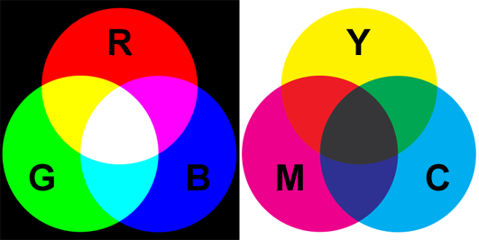
Another way of creating colors is not with light but with paint for example. The sensation of colors with a painting does not come from light being emitted by the canvas but from light emitted by another luminous source (the sun, a light bulb) being reflected off the canvas. When white light strikes the surface of a canvas, some of that light is absorbed by the paint layer and some is reflected back in the scene. For example, yellow paint appears yellow under white light because its absorbs the blue light from the white light and reflects back red and green light which combined together produce yellow light (figure 4). Note that yellow paint illuminated with blue light will appear black. If you remove green light from white light, you are left with red and blue which added up, produce magenta. And if you remove red from white light you get cyan, which is the result of adding up green and blue. The three colors that we get by subtracting one of the primary colors from white light are yellow, magenta and cyan; they are called secondary colors if you use the additive model, and primary color is you use the subtractive model. In the subtractive model, if you mix yellow paint with magenta paint will give you red. If the yellow color is the result of white light minus blue light and magenta is the result of white light minus green, then mixing yellow and magenta means you end up with white light minus blue and green. The only color that is then left from the entire spectrum is red (figure 5). The same logic can be used to find the other colors we get by mixing yellow and cyan (green) and cyan with magenta (blue). In the case of the subtractive color model, red, green and blue are called secondary colors.
Lightness of Colors
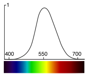
The human eye perceives some colors as being brighter than others. It is not equally sensitive to all the wavelengths from the visible spectrum. Generally, you will perceive blue colors as the dimmest, while greens are usually perceived as the brightest with red colors somewhere in between blue and green. More precisely, colors within the range 555 to 560 nanometres (green towards yellow) are perceived by the human eye as being the brightest of all the colors from the visible spectrum. The term lightness, tone or value (for example in the color model HSV which you can find more information about in the 2D section) of a color can be used if you need to refer to how bright it is perceived by the human eye. Note that the concept of the brightness of a color is subjective and is based on the way our eyes are tuned to react to light colors of certain frequencies (the sensitivity to light of the human eye). Avoid to use the term luminance in this context, which is used in photometry (photometry is the science of measuring light in terms of its perceived brightness to the human eye. We will learn more on photometry in the next chapters and the lessons on shading). We will learn about photometry and luminance in the lesson on light-matter interaction. The following image in similar to the spectrum image we showed above but the color have been weighted to reflect how the human eye perceives some colors from the spectrum as being brighter than others.

How bright these colors appear to the human eye can be described by a function which is called the luminosity function (figure 4). It describes the average visual sensitivity of the human eye to light of different wavelengths. The luminosity function is not the same under low light (scotopic vision) and well-lit conditions (photopic vision). In low light conditions, the rod cells responsible for the scotopic vision are more sensitive to wavelength of light around 500 nm and are insensitive to wavelengths longer than about 640 nm.
Spectral Power Distribution

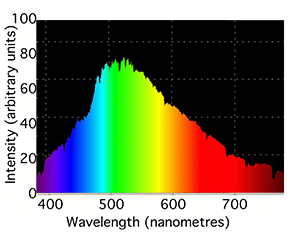
You may know or have noticed that lamps which we commonly found around us are rarely white. In fact, each type of lamp can't produce all colors from the visible spectrum in equal amount. Fluorescent lamps produce most light colors in equal amount but exhibit some spikes in some narrow bands of the spectrum. Incandescent light (the lamps commonly used prior to the fluorescent lamp technology) tend to emit all light colors but in increasing intensity as we move from the left to the right of the spectrum. Each light source is usually characterized by the range and intensity of colors it produces at each wavelength in the visible spectrum. This can be seen as the signature of the light and is called its spectrum or spectral power distribution (SPD). Light spectrums are usually very different from each other and can usually give an indication of how the lamp is made (for instance which gas it contains). It is represented as a curve which indicates the intensity with which each particular light source emits each light color from the visible spectrum (the curve is a function of the light wavelength). The top of figure 7 shows the spectrum of a typical incandescent light bulb. Note that it gives out mainly red and infrared light (light sources can produce light outside the visible spectrum) but we usually perceive these lights as being slightly yellow because the eye is less sensitive to red light (and also because very little blue light is produced). The second graph in figure 7 shows the spectrum of compact fluorescent light which contains two gases, mercury and phosphor. The very intense sharp spikes are from the mercury and the relatively weak, smooth background from the phosphor.
The sun has a spectrum that is of particular interest because our star produces light that we consider as our reference for natural lighting. The spectrum of the sun varies across the surface of Earth. Sun light and radiation is not the same as the poles than it is for instance at the equator and also varies with altitude. However, generally, the sun's spectrum looks similar to the curve showed in figure 8.

Because the sun's spectrum can change depending on so many factors (including pollution), a standard called D65 was defined (by the International Commission on Illumination) to represent what is considered as the average spectrum of the sun in average conditions: it corresponds to what the spectrum of the sun would typically look like on a midday sun somewhere in Western/Northern Europe (figure 9). This D65 which is also called the daylight illuminant is not a spectrum which we can exactly reproduce with a light source but rather a reference against which we can compare the spectrum of existing lights. If the spectrum of these lights get close enough to that of the D65 (they produce a spectrum and a light color close to that of an average midday sun) then they can be labeled as being daylight or D65 light sources (and produce a sensation of natural light). We will learn about these standards later on in this lesson and in the advanced section.
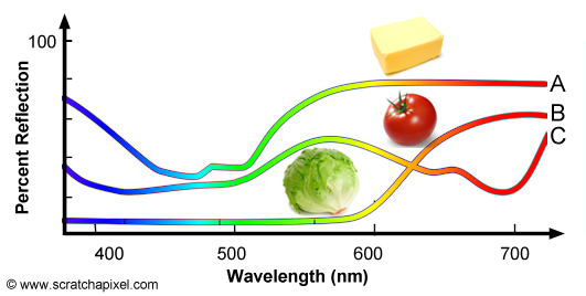
The concept of SPD is not limited to light sources and can also be used to define the colors of objects, however for objects we speak of spectral reflectance curve. There is an important difference between light sources and objects. In the case of lights sources, SPDs define the color of the light as well as its intensity. We will learn further down how we can compute the light's intensity from its SPD. In the case of objects, the spectral reflectance curve only represents the fraction of light reflected by the surface of the object over the amount of white light illuminating the object. Objects do not emit light, they only reflect light produced by light sources and they can't reflect more light than they receive thus for objects, spectral reflectance curves are expressed as a percentage of reflection. Figure 10 shows the spectral reflectance curve of three objects: butter, tomato and lettuce. Butter (A) reflects mainly green and red light which combined together produce a yellowish color. Tomato (B) reflects mainly red light and lettuce (C) reflects mainly green light. For more information on SPDs and spectral reflectance curves, check the lesson on light-matter interaction.
Finally it is worth mentioning that the International Commission on Illumination has also defined another useful standard which is called the Color Rendering Index (CRI or Color Rendetion Index) which is related in a way to the D65 standard illuminant. It defines the ability of a light source to reproduce the color of an object as seen under a reference illuminant (which in this case is the sun). It is defined by the CIE (Commission Internationale de l'Eclairage in French) as:
**Color rendering**: Effect of an illuminant on the color appearance of objects by conscious or subconscious comparison with their color appearance under a reference illuminant.
This definition insists on the fact that comparing colors is a subjective exercise as we mentioned in the introduction. The CRI is very similar to the concept comparing the light spectrum of a lamp to that of the sun for example (D65). However the test has the advantage of being simple to conduct (it only requires a match by eye and therefore doesn't involve the usage of a spectrophotometer).
We will see later in this lesson that although expensive to evaluate, a 3D renderer can use the spectrum response of light sources to compute their contribution to the scene rather than the simplified and more common RGB model. Using a spectral representation of color in a renderer can be useful for simulating real-world lighting (for example for architectural rendering). The Maxwell renderer uses this approach.

The term color temperature is sometimes used to speak about color. Similarly we also sometimes say of a color that it is cold if it is blue and warm if it is more towards yellow. This terminology comes from the fact that when an object is raised to a certain temperature, it emits visible light and the color of this light depends on the object's temperature. This phenomenon is called black body radiation and is explained in the lesson Black Body in the advanced section (melted lava is an example of a black body. The sun too is a black body and its temperature is about 5700K).
What is White?

White is not produced as we mentioned before by a light which would have a unique wavelength. It corresponds to the color we perceive when all three types of color sensitive cone cells from our eyes, are stimulated by light in more or less equal amount. Because white light is composed of all the colors from the visible spectrum mixed up in equal amount, the SPD of this light is a straight line (figure 11). Lights with a constant SPD doesn't really exist in the real world but but because it can be useful to have such SPD as a theoretical reference, the CIE provides an equi-energy spectrum standard called the E illuminant. This is illuminant is defined as having equal spectral irradiance per unit wavelength interval (in other words is has a constant SPD inside the visible spectrum). The E illuminant is not considered as a black body and therefore doesn't have a color temperature.
The Power of Light

We have already mentioned in this chapter that SPDs can be used to describe both the power and the chromaticity of light sources. If we were measuring the SPD of a light source for different levels of brightness (light intensity can be adjusted with a dimmer switch), the distribution of colors across the visible spectrum (the spectral distribution) for this light would stay the same. What would actually change is the amplitude of each color from the visible spectrum emitted by the light. The curves in figure 12 represent the SPDs of two light sources. The shape of the curves is the same (the spectral distribution of these two SPDs is the same) thus the color or chromaticity of the two light sources is also the same. However the amplitude of the top curve is twice as much as the amplitude of the bottom curve, thus the light source corresponding to the top curve, produces twice as much power than the light source defined by the bottom curve. In summary, the spectral power distribution of a light source not only defines its color but also defines its power. You can learn how the power of a light source can be computed from its spectral power distribution in the next chapter, the lesson on light-matter interaction and the lesson on black body (in the advanced section).
What's Next
In the next chapter we will learn how we can represent color in a program using spectrums or by simply mixing the additive primary colors (red, green and blue) which we know as the RGB color model.